Post at least one visual graphic that can illustrate your project. Describe the visual and explain its significance. This can be an image found online, a graph that you have prepared in PowerPoint, or any other visual aid that can help other people understand your project. Ideally, this should be a visual aid you might include in your oral presentation. You are welcome to include it with the final paper as well, if appropriate.
Using data from the Delta Cost project of all Public educational institutions, I was able to create these graphs I will be using in my essay.
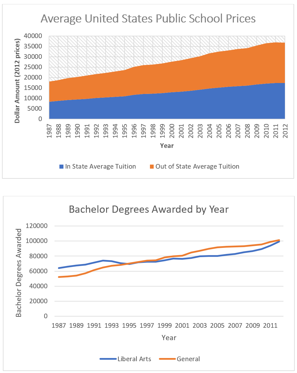
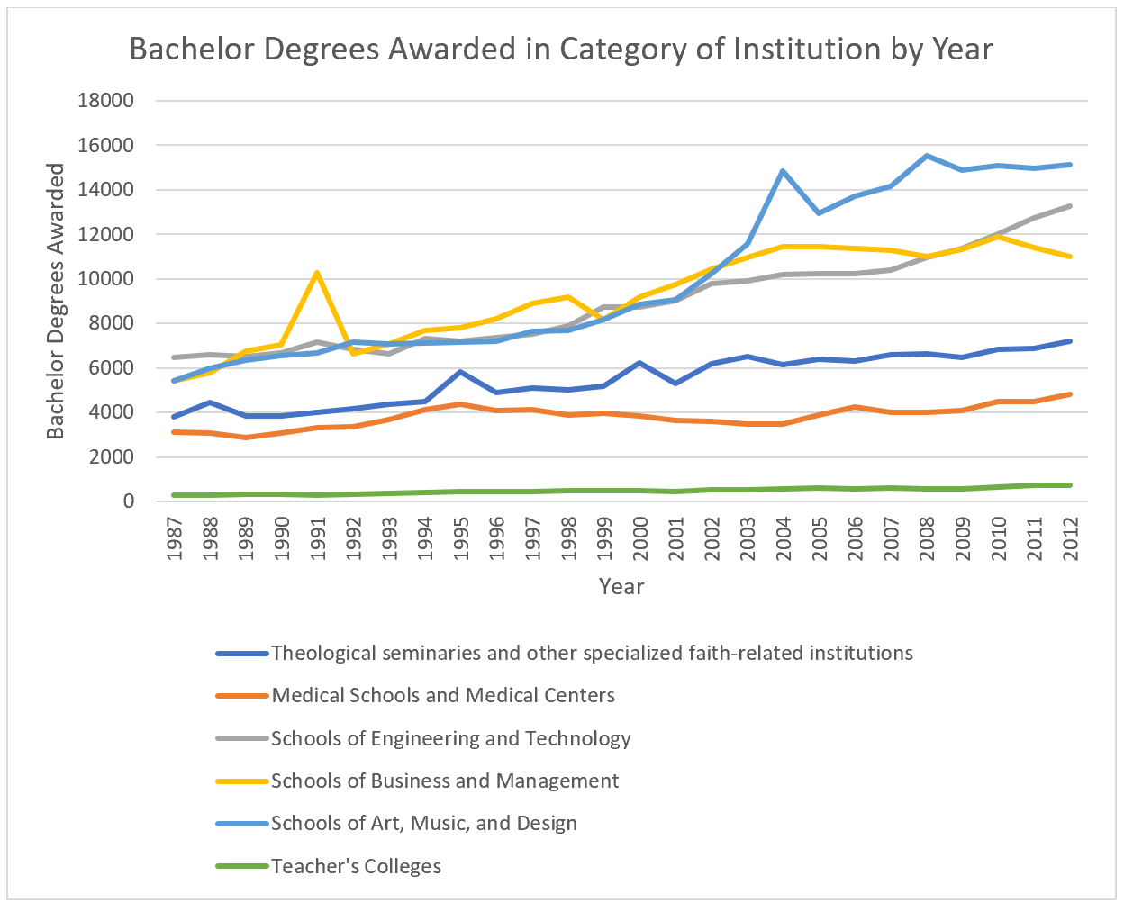
For graph #2 and 3, I took a different method since I didn't need to adjust for price levels. Using the Carnegie2000 school classification, I was able to separate my data into different categories in order to see what types of schools students were completing at a bachelor level, by year. Since the categories "general" and "Liberal Arts" outweighed everything else, I decided to separate them into to graphs as you can see above. The data definitely surprised me, despite the increase in student body, we can see a large rise in theology schools and faith related institutions offering the largest change. Another thing of note is the rise in liberal arts, which I have some good supporting sources for as well. I will probably use these for my oral presentation, and I plan on making a few more if I can find another good source of data for another supporting idea I have.
https://gyazo.com/65d847a151269bb7ebd06a223ed32a40
ReplyDelete